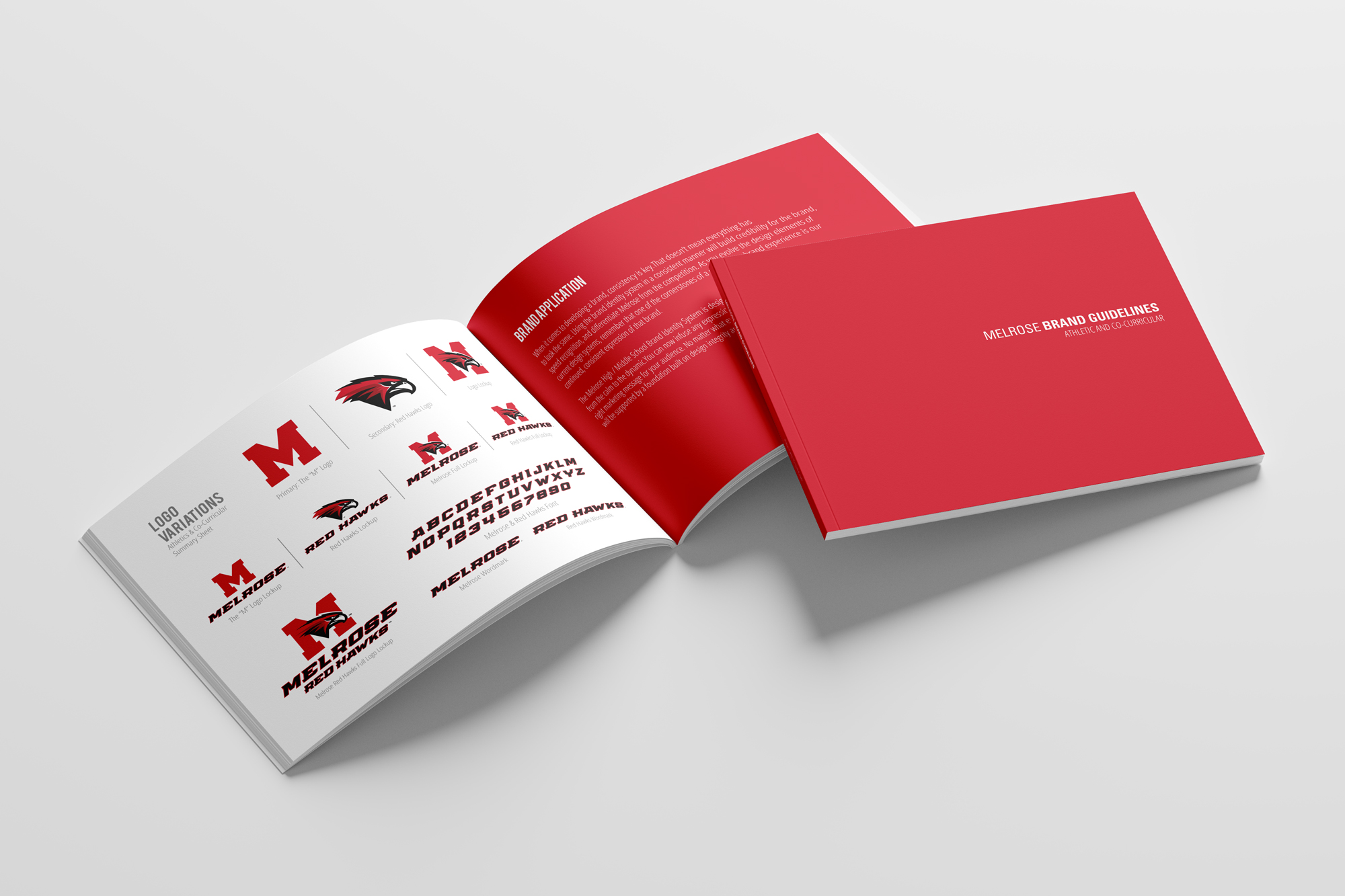
Melrose Public Schools’ rebrand to the Redhawks establishes a unified, energetic identity that blends modern athletics culture with community pride, using a bold color palette, sharp hawk iconography, and strong collegiate typography to signal speed, focus, and resilience across teams, campuses, and district communications; the brand voice is confident, spirited, and inclusive—celebrating teamwork, determination, and academic excellence while speaking in clear, uplifting language that resonates with students, families, and alumni and positions the Redhawks as a symbol of shared momentum and forward progress for the entire Melrose community.
Project
District Wide Rebranding
Location
Massachusetts