
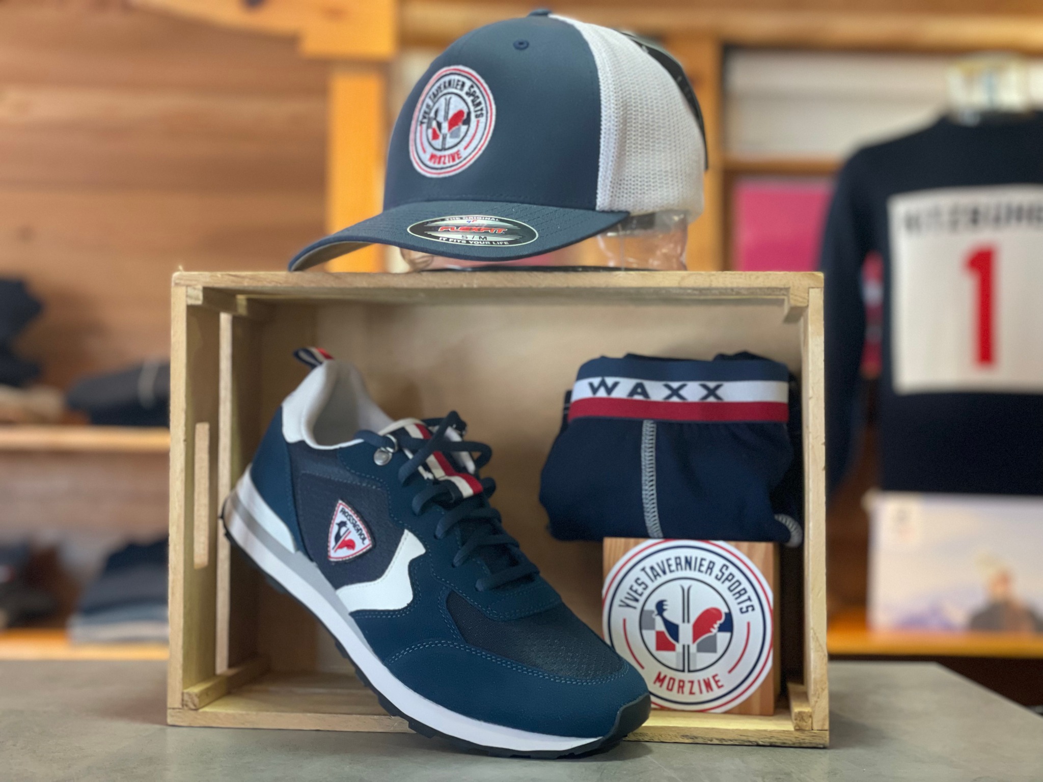
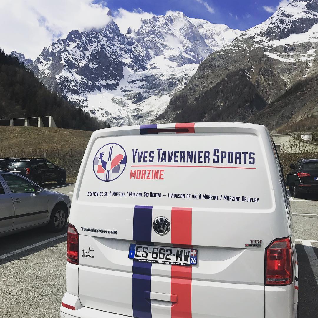
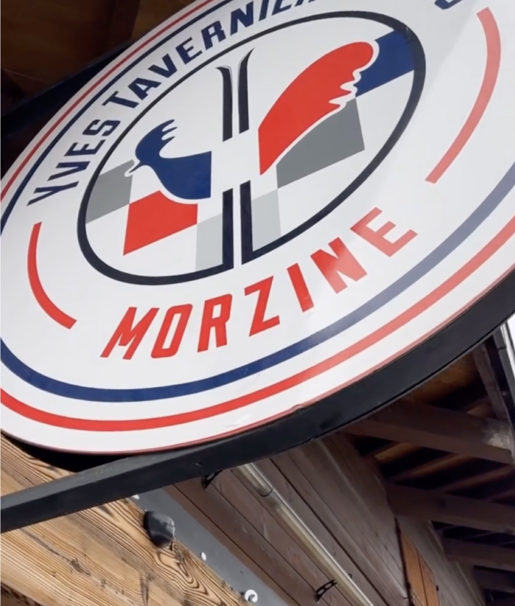
The logo for Yves Tavernier Sports begins with understanding its identity as a long‑standing Morzine ski‑rental and apparel outfitter, where heritage, trust, and alpine energy all need to coexist in a single visual mark. The process starts by defining the brand’s tone—authentic, local, and performance‑driven—and mapping how the logo must function across apparel embroidery, rental equipment labeling, storefront signage, digital booking platforms, and on‑mountain visibility. From there, a visual strategy is built around the brand’s core symbols, such as the iconic rooster emblem and the blue‑red alpine palette, establishing the shape language and typography that anchor the narrative of a classic French mountain shop. Concept development explores variations ranging from modernized badges to simplified monograms that still feel unmistakably Morzine, testing each direction for clarity at distance, legibility on jackets and helmets, and durability on signage exposed to winter conditions. Once a direction is chosen, refinement focuses on proportion, balance, and scalability so the mark holds up equally well on a rental ski tag, a shop window, or a premium softshell jacket. The final stage systematizes the identity into a cohesive package—color specs, type rules, embroidery‑safe line weights, signage layouts, and real‑world mockups—ensuring Yves Tavernier Sports presents a consistent, confident, and instantly recognizable presence across every touchpoint in the village and on the mountain.